Once you can name something, you’re conscious of it. You have power over it. You’re in control. You own it.
The four basic principles
Contrast
The idea behind contrast is to avoid elements on the page that are merely similar. If the elements (type, color, size, line thickness, shape, space, etc.) are not the same, then make them very different. Contrast is often the most important visual attraction on a page—it’s what makes a reader look at the page in the first place. It also clarifies the communication.
Contrast is one of the most effective ways to add visual interest to your page and to create an organizational hierarchy among different elements. For contrast to be effective, however, it must be strong.
The Principle of Contrast states: Contrast various elements of the piece to draw a reader’s eye into the page. If two items are not exactly the same, then make them different. Really different.
Contrast can be created in many ways. You can contrast large type with small type; a graceful old-style font with a bold sans serif font; a thin line with a thick line; a cool color with a warm color; a smooth texture with a rough texture; a horizontal element (such as a long line of text) with a vertical element (such as a tall, narrow column of text); widely spaced lines with closely packed lines; a small graphic with a large graphic.
Contrast has two purposes, and they’re inextricable from each other. One purpose is to create an interest on the page—if a page is interesting to look at, it is more likely to be read. The other is to aid in the organization of the information. A reader should be able to instantly understand the way the information is organized, the logical flow from one item to another.
Repetition
Repeat visual elements of the design throughout the piece. You can repeat colors, shapes, textures, spatial relationships, line thicknesses, fonts, sizes, graphic concepts, etc. This develops the organization and strengthens the unity.
The Principle of Repetition states: Repeat some aspect of the design throughout the entire piece. The repetitive element may be a bold font, a thick rule (line), a certain bullet, design element, color, format, spatial relationships, etc. It can be anything that a reader will visually recognize.

A repetition of visual elements throughout the design unifies and strengthens a piece by tying together otherwise separate parts. Repetition is very useful on one-page pieces, and is critical in multi-page documents (where we often just call it being consistent).
The purpose of repetition is to unify and to add visual interest. Don’t underestimate the power of the visual interest of a page—if a piece looks interesting, it is more likely to be read.
Alignment
Nothing should be placed on the page arbitrarily. Every element should have some visual connection with another element on the page. This creates a clean and sophisticated look.
The Principle of Alignment states: Nothing should be placed on the page arbitrarily. Every item should have a visual connection with something else on the page. When items are aligned on the page, the result is a stronger cohesive unit. Even when aligned elements are physically separated from each other, there is an invisible line that connects them, both in your eye and in your mind.


Get in the habit of drawing lines between elements to determine where the connections are lacking. Take a moment to decide which of the items above should be grouped into closer proximity, and which should be separated.By moving all the elements over to the right and giving them one alignment, the information is instantly more organized.
Unity is an important concept in design. To make all the elements on the page appear to be unified, connected, and interrelated, there needs to be some visual tie between the separate elements. The basic purpose of alignment is to unify and organize the page.
Proximity
Items relating to each other should be grouped close together. When several items are in close proximity to each other, they become one visual unit rather than several separate units. This helps organize information, reduces clutter, and gives the reader a clear structure.
The Principle of Proximity states: Group related items together. Move them physically close to each other so the related items are seen as one cohesive group rather than a bunch of unrelated bits.
When several items are in close proximity to each other, they become one visual unit rather than several separate units. Items relating to each other should be grouped together. Be conscious of where your eye is going: Where do you start looking; what path do you follow; where do you end up; after you’ve read it, where does your eye go next? You should be able to follow a logical progression through the piece, from a definite beginning to a definite end.
The basic purpose of proximity is to organize. If the information is organized, it is more likely to be read and more likely to be remembered. As a by-product of organizing the communication, you also create a more appealing (more organized) white space (designers’ favorite thing).
How to get it - Squint your eyes slightly and count the number of visual elements on the page by counting the number of times your eye stops. If there are more than three to five items on the page (of course it depends on the piece), see which of the separate elements can be grouped together into closer proximity to become one visual unit.
The amazing color wheel
The color wheel begins with yellow, red, and blue. These are called the primary colors because they’re the only colors you cannot create. Now, if you take your watercolor box and mix each of these colors with an equal amount of the one next to it, you’ll get the secondary colors. As you’re probably aware from working with crayons and watercolors as a kid, yellow and blue make green; blue and red make purple; red and yellow make orange.To fill in the empty spots in the color wheel, you probably know what to do—mix equal parts of the colors on each side. These are called the tertiary (or third) colors. That is, yellow and orange make, well, yellow-orange. And blue and green make blue-green (which I’ll call aqua).


Colors directly across from each other, exact opposites, are complements. Because they’re so opposite, they often work best when one is the main color and the other is an accent.


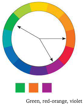
A set of three colors equidistant from each other always creates a triad of pleasing colors. Red, yellow & blue are the primary colors, this combination is called the primary triad.Experiment with the secondary triad of green, orange, and purple—not as common, but an exciting combination for that very reason.


Split complement triads - Another form of a triad is the split complement.
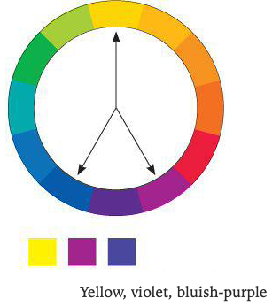
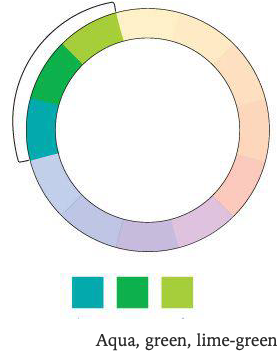


Analogous colors - An analogous combination is composed of those colors that are next to each other on the wheel.
Monochromatic
Shades and tints - The basic color wheel that we’ve been working with so far involves only the hue, or the pure color. We can hugely expand the wheel and thus our options simply by adding black or white to the various hues.
The pure color is the hue.
Add black to a hue to create a shade.
Add white to a hue to create a tint.

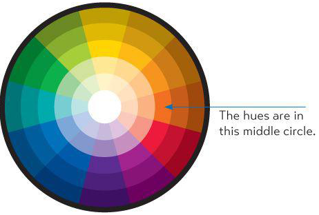
Monochromatic colors - A monochromatic combination is composed of one hue with any number of its corresponding tints and shades.
Tone refers to the particular quality of brightness, deepness, or hue of any color. Colors tend to be either on the warm side (which means they have some red or yellow in them) or on the cool side (which means they have some blue in them).The most practical thing to remember is that cool colors recede into the background, and warm colors come forward.
CMYK stands for Cyan (which is a blue), Magenta (which is sort of red/pink), Yellow, and a Key color, which is usually blacK. With these four colors of ink, we can print many thousands of colors, which is why it’s called a four-color process.
Use CMYK for projects that are to be printed.
Use RGB for anything that will be viewed on a screen.Because RGB works through light that goes straight into our eyes, the images on the screen are gorgeous and backlit with an astonishing range of colors. Unfortunately, when you switch to CMYK and then print that with ink on paper, you lose some of that brilliance and range.
White space! Take note of where your eyes go next time you scan the newspaper. Which ads do your eyes naturally land on, and which ads do you actually read? I’ll bet you see and read at least the headlines of the ads that have more white space.
Check out the many templates on CreativeMarket.com for résumés that go beyond Times 12-point centered.
Repetition - Be consistent. Repeat the basic structure of information; that is, if you set the dates in the left column for one area, use that same format for the other areas. If you use an alignment for a certain sort of item, repeat that alignment in other areas. If you use color to indicate something in particular, perhaps pull that color into something else such as a ruled line or bullets.
Alignment - As you have noticed, the Principle of Alignment is crucial to the overall presentation of neatness and professionalism.
Proximity - Position the headings closer to the related information so the structure is clear. Keep bullets close to their items.
Match the design to the medium - You will have to make different decisions if the resume is to be handed or mailed to somone, posted online, or perhaps posted online but you expect someone to print it. Each of these variants will impact your layout, font choice, page size, color choices, and more. Oh, our world is getting so complicated.
The Essentials of Typography
One space after punctuation
Opening quotation marks are shaped like sixes and closing marks like nines: opening and closing 66 and 99 sixes and nines. In the United States, commas and periods are always inside the quotation marks. Always. Really. (In the U.K., they can go in or out.)
Except for possessive words (such as Mary’s poem or the dog’s bone), an apostrophe means a letter is missing (isn’t or don’t or you’re). Thus in the phrase Rock ’n’ Roll, there should be an apostrophe where the a is missing and also where the d is missing. It should NOT look like this: ‘n’ Wrong!!!! Apostrophes are shaped like 9s.
Special characters on the PC & MAC


Setting words in ALL CAPS to call attention to them is not always the best solution because all caps are actually more difficult to read than lowercase.
Do not use the underline button. Ever.
Paragraph indent or extra space between paragraphs: An indent means, This is a new paragraph. Extra space between paragraphs also means, This is a new paragraph. Thus you need to pick one: Either indent new paragraphs or use extra space between paragraphs, not both.
First paragraphs: Following the logic of the above principle, you can understand why the first paragraph following a heading or subhead does not need an indent. Ever.
Setting text in a frame or box: If you do set text inside a box, leave plenty of room on all sides.
Use bullets or ornaments in a list, not hyphens:
A concordant relationship occurs when you use only one type family without much variety in style, size, weight, and so on. It is easy to keep the page harmonious, and the arrangement tends to appear quiet and rather sedate or formal—sometimes downright dull.
A conflicting relationship occurs when you combine typefaces that are similar (but not the same) in style, size, weight, and so on. The similarities are disturbing because the visual attractions are not the same (concordant), but neither are they different (contrasting), so they conflict.
A contrasting relationship occurs when you combine separate typefaces and elements that are clearly distinct from each other. The visually appealing and exciting designs that attract your attention typically have a lot of contrast built in, and those contrasts are emphasized.
There are six clear and distinct ways to contrast type: size, weight, structure, form, direction, and color. The rest of this book talks about each of these contrasts in turn. If you have trouble seeing what is wrong with a combination of typefaces, don’t look for what is different between the faces—look for what is similar. It is the similarities that are causing the problem.
The major rule to follow when contrasting type is this: Don’t be a wimp!
Sans serif - The word sans means without (in French), so sans serif typefaces are those without serifs on the ends of the strokes. Sans serif typefaces are almost always monoweight, meaning there is virtually no visible thick/thin transition in the strokes; the letterforms are the same thickness all the way around.
Optima is an exceptionally beautiful typeface (sans serif), but you must be very careful about combining it with other faces.
So if you are new to the idea that one font looks different from another, an easy way to choose contrasting structures is to pick one serif font and one sans serif font. Combining serif with sans serif is a time-tested combination with an infinite variety of possibilities. But as you can see in the example below-left, the contrast of structure alone is not strong enough; you need to emphasize the difference by combining it with other contrasts, such as size or weight.
Type slanting upward to the right creates a positive energy. Type slanting downward creates a negative energy. Occasionally you can use these connotations to your advantage.
When you’re talking about actual color, remember to keep in mind that warm colors (reds, oranges) come forward and command our attention. Our eyes are very attracted to warm colors, so it takes very little red to create a contrast. Cool colors (blues, greens), on the other hand, recede from our eyes. You can get away with larger areas of a cool color; in fact, you need more of a cool color to create an effective contrast.

Before trying to find a better solution, you must find the problem. To find the problem, name the similarities—not the differences. What is it about the two faces that compete with each other? Are they both all caps? Are they both typefaces with a strong thick/thin contrast in their strokes? How effective is their contrast of weight? Size? Structure?
Or perhaps the focus conflicts—is the larger type a light weight and the smaller type a bold weight, making them fight with each other because each one is trying to be more important than the other?
Name the problem, then you can create the solution.

1. Don’t. Two scripts will conflict with each other because they have similar forms.
2. Don’t. Typefaces from the same category have similar structures.
3. Don’t. They will fight with each other. Decide what is the most important and emphasize that item.
4. Don’t. Most scripts and italics have the same form—slanted and flowing.
5. Do. You instantly have a strong contrast of structure and color.
6. Do. You instantly have a contrast of structure and color, but you will still need to work with it.
7. Don’t. Two fancy faces will usually conflict because their fancy features both compete for attention.
8. Don’t. Your purpose in putting type on a page is to communicate.
9. Do.
10. Do. The basic law of breaking the rules is to know what the rules are in the first place. If you can justify breaking the rules—and the result works—carry on!
References
CreativeMarket.com: This is like Etsy.com for designers, where you can buy terrific assests inexpensively—fonts, templates, images, and so much more.